Blue Cross Blue Shield of Rhode Island Case Study Simplifying Insurance Choice and Purchase Decisions through UI/UX Design
The Opportunity Create an Intuitive Interface to Promote Simplified Decision-making Experiences for Users
Blue Cross Blue Shield of Rhode Island (BCBSRI) is a non-profit health insurance organization serving Rhode Island residents. BCBSRI is dedicated to improving the health and well-being of members by providing access to quality healthcare services and innovative wellness programs. The organization offers a range of health insurance products, including individual, group, Medicare, and Medicaid plans. They work closely with healthcare providers and community organizations to promote preventive care and disease management.
The health insurance industry is significantly transforming as it shifts towards a business-to-consumer (B2C) approach, leaving many consumers in the driver’s seat to make important healthcare decisions. Complex terminologies, premiums, deductibles, and copays can be overwhelming, and many individuals need help understanding and selecting the right plan for their needs.
BCBSRI recognized the need to take action and provide better guidance and education to their customers. By doing so, they aimed to become a trusted partner, providing reliable and effective healthcare solutions. The goal was to help patrons choose the right plan to meet their current needs and foster a long-term relationship.
Our Response Leveraging User Data to Redesign Direct Pay and Medicare E-commerce Experiences
The previous website was not user-friendly, with an uninformative user experience and confusing language. Many customers had to contact the call center or speak with a sales representative for guidance and reassurance, which resulted in a fragmented and disjointed process. Site analytics revealed a staggering 85% drop-off rate at the start of the customer journey, indicating that users struggled to navigate the site and obtain the information they needed to make a purchase decision.
Enhancing Site Navigability and Workflows to Improve Product Discovery and Customer Engagement
MojoTech conducted a comprehensive workflow design review to enhance the site’s navigability using customer feedback, internal call center, and sales data. We identified an intrusive modal window that impeded potential customers from taking the desired action. Eliminating this seemingly insignificant obstacle led to a remarkable reduction in bounce rates.
Encouraged by this success, we continued eliminating other barriers hindering customers from finding what they sought. Our strategy included restructuring the information architecture, incorporating user experience (UX) enhancements and tools, simplifying language in the website’s copy, and creating a versatile platform that accommodated customers across all channels: online, in-store, or through a sales representative.
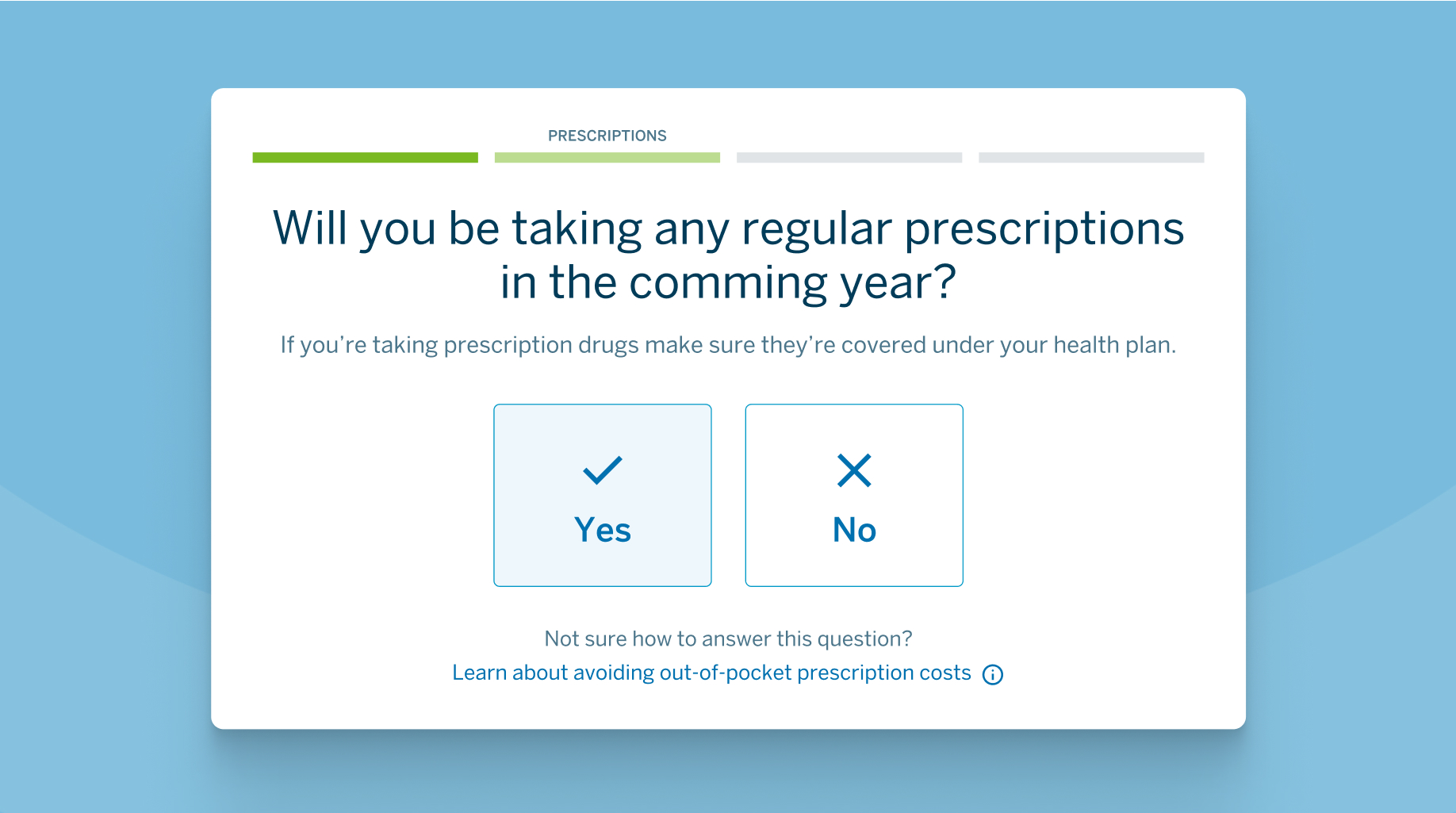
Additionally, we introduced progress bars to guide customers through the application process. These bars visually displayed customers’ progress toward completing their goals, helping them feel more confident and engaged. With these optimizations, BCBSRI aimed to provide a more efficient and intuitive user experience, regardless of the customer’s preferred engagement channel.
By implementing progress bars at the top of the screen, customers were able to easily see that they were making progress towards completing a goal.
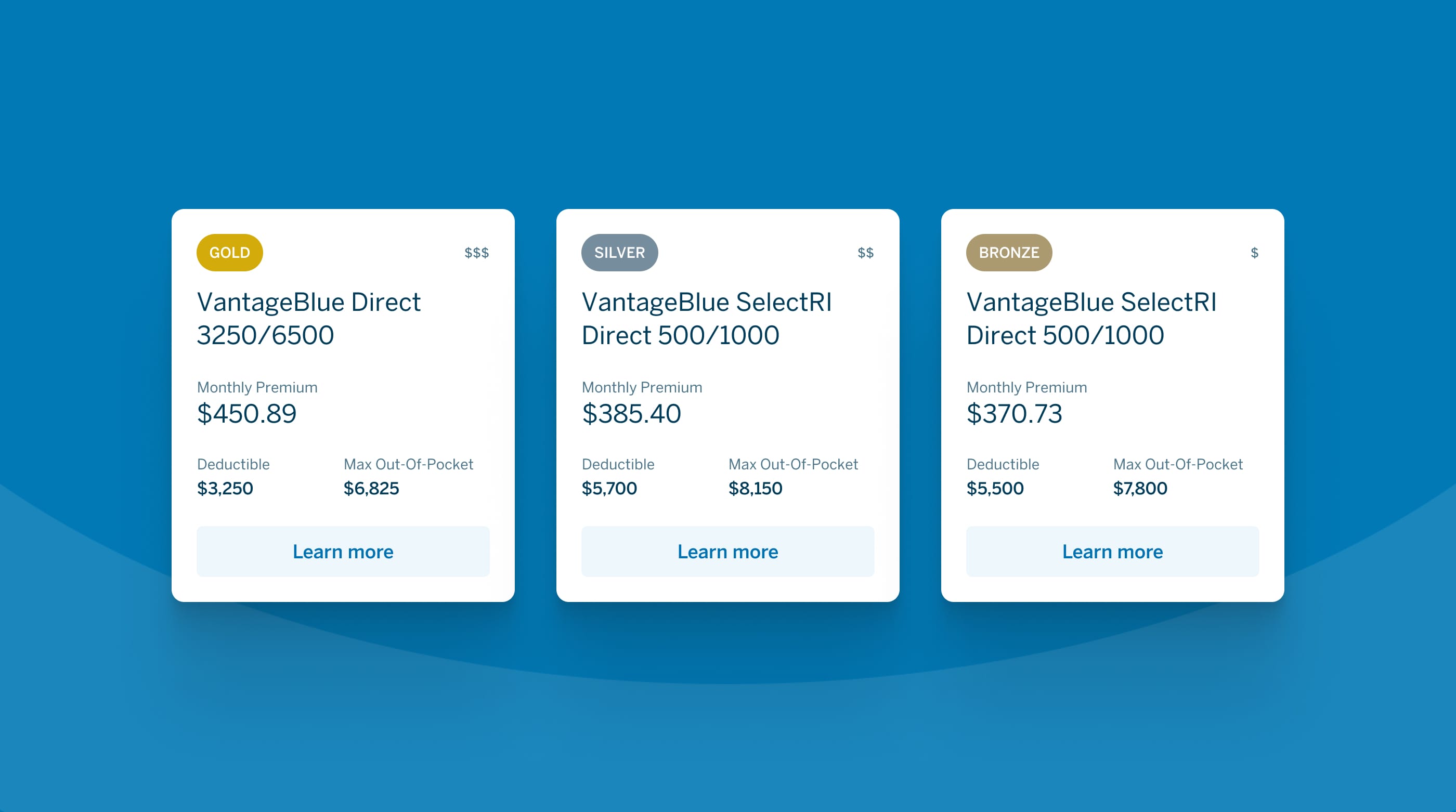
Simplifying the Plan Selection Process to Boost Conversion Rates
To increase conversion rates, it was crucial to understand why potential and existing customers were abandoning their shopping carts. Through user feedback and interviews, we discovered that customers wanted to know if BCBSRI plans covered their top healthcare concerns. However, the existing site overwhelmed them with a barrage of personal questions, leading to fatigue and abandonment. Our team dug into the complexities of this process to find the minimum information needed to provide a high-level overview of the best plans for each customer.
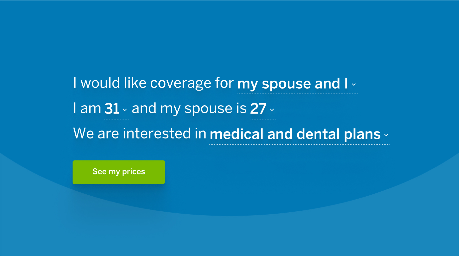
We simplified the process by breaking down the customer information form into easy-to-understand sentences. Once customers felt confident, we guided them through a multi-step questionnaire to further filter relevant plans and generate a preliminary quote.
To make the process friendly and simple, we broke down the customer information form into a simple sentence format.
Streamlining the Process of Finding and Switching Health Insurance Plans to Increase Retention
To ensure that the process of exploring new health insurance plans was efficient, we focused on providing a frictionless experience with helpful guidance and tools. We understood that when customers are matched with a plan that best suits their needs, they are less likely to switch to a competitor. However, significant life changes can necessitate reassessing their current plan and exploring their options.
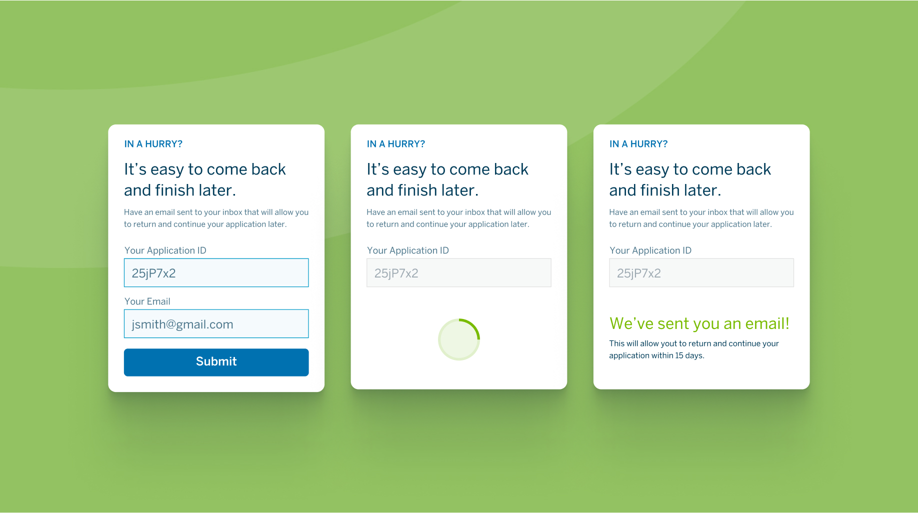
To address this, we designed a multi-step form submission tool with a Save feature, making it easy for customers to review new plans that fit their changing circumstances, switch plans, and add dependents. The Save feature enables customers to take their time and gather any missing information before they submit their applications. Furthermore, this tool makes it easy for customers to complete the process through multiple channels, beginning at a retail location with the aid of a sales representative and finishing the application at home, filling in any missing information, and submitting it.
The Outcome Improving User Experiences Increases Digital Enrollment and Streamlines Operations
The focus on making the experience easy, human, and data-driven is the biggest differentiator for BCBSRI in a highly competitive industry. The new platform enhances the experience of choosing a health insurance provider by making the value exchange of buying a plan more rewarding. BCBSRI empowers the customer to make informed decisions about what matters most: healthcare for family and the future.
As a result of the UI/UX redesign, BCBSRI saw a 161% increase in Individual application conversion rates, a 40% increase in Medicare application conversions, a 390% increase in Member Events RSVPs, and a 30% increase in cross-sell.
161%
Increase in individual plan conversion
40%
Increase in Medicare plan conversion
30%
Increase in cross-sell
"We wanted to find a better way for our customers to make informed decisions about their coverage without the established frustrations. Partnering with MojoTech was an important step in bringing innovative, user-centric technology and design to the health insurance industry, and we’re proud to be one of the leaders in this space."
John Auger
Director of Channel Management, Blue Cross & Blue Shield of Rhode Island
Increase Operational Efficiency
By allowing customers to shop and sign up for their healthcare insurance through their preferred channel, BCBSRI eliminated inefficiencies and reduced clerical errors and paper waste. This was made possible by transitioning to an online platform that provided BCBSRI representatives and customers with the same tools and forms, ensuring consistency and accuracy in the enrollment process. The move to a digital platform streamlined operations and improved the customer experience by providing a convenient and user-friendly way to enroll in health insurance plans.