When choosing between data visualization tools, one option worth considering is Google Sheets.
Google's spreadsheet application can be used to generate charts, tables and even maps that can be embedded on a website. They're easy to make and can be configured to update automatically.
It's not for every visualization need. Some projects require more complicated data visualization techniques and more customization than what Google Sheets provides.
Some pros to using Google Sheets for visualizations:
- Little to no programming required
- Can be published on most sites with an embedded iframe
- Chart data can be maintained by a non-technical person
- Charts can be configured to update automatically
Cons:
- Charts are difficult to make responsive to various browser sizes
- Limited customization
- Limited visualization types
Google Sheets provides a kind of "front end" to a limited part of the Google Visualization API. That is, you enter or load your set of data in a spreadsheet, choose a chart type and insert it using the Google chart helper, then publish the resulting visualizations on your website.
What's more, you can program the spreadsheet to fetch updated data sets automatically, which means you can publish live, automatically updating visualizations.
This tutorial is about how to do that. To start, open a new Google Sheet.
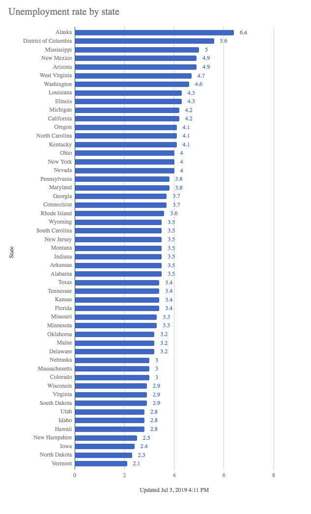
For data, we'll use unemployment figures from the Bureau of Labor Statistics, the U.S. agency that tracks the unemployment rate and contains the latest unemployment rates for each U.S. state.
Importing HTML into a Google sheet
To get this data into a spreadsheet, you can cut and paste. But there is a better way: tell Google sheets to import this data set for us.
Past the url In cell A1, then enter this formula in cell A2:
\=importhtml(A1, "table", 2)
The import html function imports the HTML from the website in cell A1, gets the second table on the web page and pastes it into the spreadsheet.
Note: Make sure to use quotation marks around "table" as single quotes will cause an error.
How did I know we wanted the second table? View the source code on the BLS web page and count which html table you want. Or you can just go by trial and error by entering another number, like 1, 2 or 3 and see what happens.
For example, if you try 1, it pulls in the table that contains the page menu. This isn’t what we want, so try 2. That works.
At this point, let’s do a little housekeeping. We'll give the spreadsheet a name "unemployment data". And let’s rename this sheet from Sheet1 to "bls_import".
Let's create a map of the US to see if there are any particular regions where unemployment is better or worse.
Creating a choropleth map
Google sheets has the ability to create a couple different types maps. One is a choropleth map, which uses color or shading to indicate differences in data.
First, highlight the State and Rate columns, On the Sheets menu choose
➔ Insert | Chart ➔ Chart type ➔ Choose the first Map type ➔ Choose the first Map type
Then in the Chart editor
➔ Click on Customize ➔ Click Geo ➔ In Region option choose United States
You’ll see a preview of what the map will look like. Let’s change the Min color, or the smaller values to Green instead of Red, since a lower number is "better" when talking about unemployment rates.
To get better advice on decision making for colors on a map, see http://colorbrewer2.org.
Once you pick your colors, click the X to close the Chart editor. And you’ve created a Choropleth map.
To publish, select the map: ➔ Click the three dots in the top right corner ➔ Choose Publish chart... ➔ Click Embed ➔ Click the green Publish button
That will give you the code you need to embed the map in a blog post, your CMS or a regular web page.
Some things you may notice: We see tooltips when you mouseover a state. But there is little control over several aspects of the map, such as how many classes or groups are created and where those groups break. There is no ability to add a title or other text for this particular chart type. And there is no legend that will tell you at a glance what the colors mean.
So there is a tradeoff for the ease in creating these maps.
Creating a bar chart
Let’s create a bar chart with the same data.
Highlight the State and Rate columns. ➔ Choose Insert | Chart ➔ Under Chart type, Choose Bar Chart ➔ Click Customize ➔ Click Series, choose Bar 1, and check the Data labels checkbox ➔ Click Chart & axis titles and change Chart title to U.S. Unemployment Rates ➔ Also under Chart & axis titles, change Vertical axis title to State ➔ Also under Chart & axis titles, remove Horizontal axis title ➔ Under legend, choose None ➔ Under Vertical axis, click the Reverse axis order checkbox
You'll probably want to stretch the bar chart vertically to make it more readable. Click and drag on the container surrounding the chart to resize it.
Publish this the same way as the other chart, grab the iframe embed code and add it to your web page.
Auto updating
We’d like the maps and charts to update in real time whenever there is new information. But there are a couple challenges.
First, the import html function only runs when you first add it to the spreadsheet, and then anytime you open the sheet. Once you close the sheet, it will go to sleep, so to speak. It will contain only the data that it pulled in the last time the sheet was opened.
There is one way to address this. A Google spreadsheet can be triggered to “wake up” every so often.
Click ➔ File | Spreadsheet settings ➔ Click on the Calculation tab ➔ Under Recalculation, choose "On change and every hour"
Google Application Script
Let's add an automatically generated "Updated at" label to the bar chart to signal when the chart was last updated. We can do that with Google Application Script, a programming language. If you’re familiar with Excel, Google Application Script is similar to writing a macro in Visual Basic. But it's based on Javascript and it's very powerful.
It will let us write to and read from various cells in the spreadsheet. It will even let us create charts, or modify ones we’ve already created.
Open the Script editor:
Click ➔ Tools ➔ Script editor
In this code window, we can write our updated label and insert it into the chart. In order to access the data on the spreadsheet, we reference it by the name of the sheet.
Inside the myFunction function, add the code as such:
This function simply gets the current date and time, formats it, and inserts it into the horizontal axis title. The `var chart = sheet.getCharts()[1];` code gets the second chart on the `bls_import` sheet by referencing `[1]`. You may need a different index number if you've created more charts.
To run the function, click on the Play icon in the toolbar. Note, Google will present a series of scary looking warnings the first time you click Run. You will need to accept these.
Running it puts our timestamp into the bar chart.
Automatic updating
Now to make this run automatically. Remember the File | Spreadsheet settings | Recalculation option? That will make the data fresh, but it won’t add the Updated at label to the chart.
But there is a way to trigger the execution of a script anytime the data in the spreadsheet changes. In the Script editor, click ➔ Edit ➔ Current project’s triggers ➔ Click create a new trigger ➔ Under Choose which function to run, select myFunction ➔ Under Select event source, choose From Spreadsheet ➔ Under Select event type, choose On change
Now, whenever the spreadsheet changes, it will trigger this script.
Conclusion
Google’s data visualization tools are very powerful. Google sheets lets you can create your own visualizations and publish them on your own site. You can update them automatically. Little coding knowledge is required. But if you are so inclined, I encourage you to dig in and learn more Javascript and about Google’s library. That knowledge will be useful in using the many other Javascript libraries that work in a similar way.